|
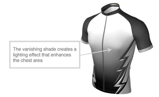
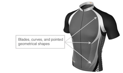
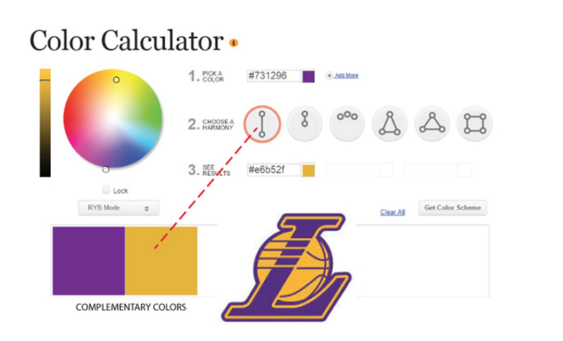
A good sportswear design graphics enhances the shape and contour of the human anatomy". If the guiding principle in making a good sportswear graphics is the enhancement of the human anatomy, then the basic concepts that we learned in school can be applied. We were taught that to highlight contours and shapes, we must use shading, contrast, shapes, curves, etc. Enumerated below are a few of the guiding principles that can help us become a great sportswear designer. LIGHT MAKES MIGHT Lighter shades and gradients on the muscle areas like chest, abs, biceps, and arms make the latter more prominent and enhance shape and contour of the human body. The sample designs below show distinct lighter shade and gradient on the chest area and includes texture and shapes on the abs area, making the design look more masculine. BLADES CUT SHAPES To enhance a shape on a body, the use of blades, curves, and pointed geometrical shapes add to the enhancement of the area that we want to highlight. For example, to create an illusion of narrow waist, the use of blades on the sides can help. DON'T IGNORE THE COLOR WHEEL Like death and taxes, there is no escaping color. The use of color can be considered an exact science despite the fact that beauty is in the eyes of the beholder. Very often, it happens that at first glance, you may consider one color combination more appealing and pleasing than another. That is because it is a fact that violating the use of the 6 color harmonies can create negative appeal and impression. To learn more about it, you may visit http://www.sessions.edu/color-calculator. It is an amazing color calculator that suggests the other colors that you can combine with your first chosen color. An ideal example is the logo of Los Angeles Lakers team. If you use the calculator, you will find out that Lakers use complementary color harmonies, wherein gold yellow is the complementary of violet. TOUCH IT, FEEL IT, SEE IT.
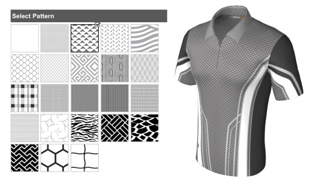
Texture is an element that plays an important role in design and is defined by two aspects - visual and tactile (sometimes referred to as feel or hand). Tactile texture is a surface quality related closely to our sense of touch. All the clothes we wear feel differently to the skin and to our hand. Tactile texture is very much dependent on the type of fabric that we use to make our sportswear. Some fabrics are soft, others are rough. There are fabrics that are weaved like honeycomb. Others are weaved satin or plain. What is more important to a sportswear designer is visual texture because it can be controlled and can be changed easily to fit a specific design concept. It is not dependent on the type of fabric. Rich, layered graphics can create visual texture that mirrors actual texture. Graphical textures can make a plain boring fabric look astonishing and elegant. Texture can also be modified and enriched with gradients to emphasize geometrical shapes and enhance body shapes. A good example is the design below. Simple diagonal lines created a rugged texture creating an illusion of a metal surface. The gradients made it look more three-dimensional and enhances the body contour.
0 Comments
Leave a Reply. |
CommentsArchives
January 2024
Categories |


 RSS Feed
